Descriptive Statistics
- 8.2.1. Correlation Tool
- 8.2.2. Covariance Tool
- 8.2.3. Descriptive Statistics Tool
- 8.2.4. Frequency Tables
- 8.2.5. Rank and Percentile Tool
8.2.1. Correlation Tool
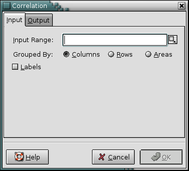
The correlation tool calculates the pairwise Pearson correlation coefficients of the given variables. Use this tool to calculate any number of correlation coefficients at the same time. The variables for which the correlations are calculated are specified by the “Input Range:” entry. The input range can consist of either a single range or a comma separated list of ranges. The given range or ranges can be grouped by columns, by rows, or by areas.
If the first row or column of the given ranges, or the first field of each area contains labels, the “” option should be selected.
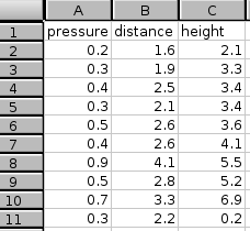
For example, you want to calculate the correlation between three variables, one each in columns A, B, and C. Both variables have 10 values in rows 2 to 11 with labels in row 1 (see Figure 8-5).
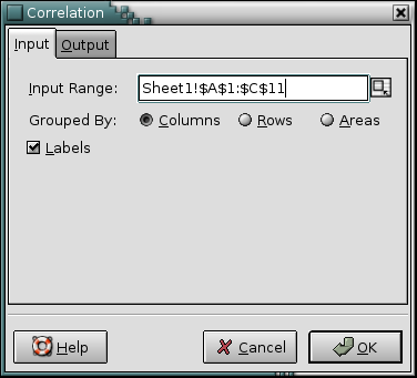
- Enter A1:B11 in the “Input Range:” entry by typing this directly into the entry or clicking in the entry field and then selecting that range on the sheet. In the latter case the entry will also contain the sheet name.
- Select the “” radio button next to “Grouped By:”, since each variable is in its own column.
- Select the “” option since the first row contains labels. (see Figure 8-6).
- Specify the output options as described above.
- Press the OK button.
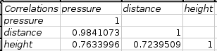
The calculated correlations are given in a table with each column and row labeled with the names of the variables. If the names are not given in the input range, Gnumeric generates them. In our example, the correlation between the variables in column A and B, can be found in the second column and third row of the results table (see Figure 8-7).
8.2.2. Covariance Tool
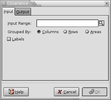
The covariance tool calculates the pairwise covariance coefficients of the given variables. Use this tool to calculate any number of covariance coefficients at the same time. The variables for which the covariances are calculated are specified by the “Input Range:” entry. The input range can consist of either a single range or a comma separated list of ranges. The given range or ranges can be grouped by columns, by rows, or by areas.
If the first row or column of the given ranges, or the first field of each area contains labels, the “” option should be selected.
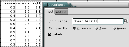
For example, you want to calculate the covariance between three variables, one each in columns A, B, and C. Both variables have 10 values in rows 2 to 11 with labels in row 1 (see Figure 8-9).
- Enter A1:B11 in the “Input Range:” entry by typing this directly into the entry or clicking in the entry field and then selecting that range on the sheet. In the latter case the entry will also contain the sheet name.
- Select the “” radio button next to “Grouped By:”, since each variable is in its own column.
- Select the “” option since the first row contains labels.
- Specify the output options as described above.
- Press the OK button.
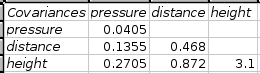
The calculated covariances are given in a table with each column and row labeled with the names of the variables. If the names are not given in the input range, Gnumeric generates them. In our example, the covariance between the variables in column A and B, can be found in the second column and third row of the results table (see Figure 8-10).
8.2.3. Descriptive Statistics Tool
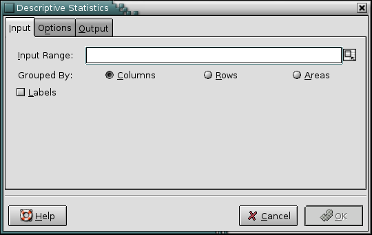
The descriptive statistics tool calculates various statistics for the given variables and a confidence interval for the population mean. The variables are specified via the “Input Range:” entry. The given range or list of ranges can be grouped into variables by columns, rows, or areas.
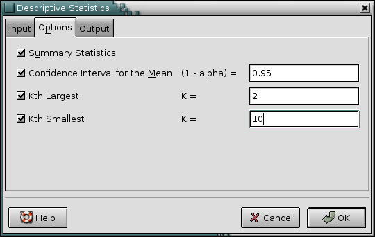
This tool can produce four different kinds of statistical data.
-
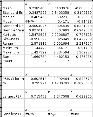
If the “” option is selected, this tool calculates the mean, standard error, median, mode, standard deviation, sample variance, kurtosis, skewness, range, minimum, maximum, sum, and count for each variable.
-
If the “” option is selected, the tool calculates confidence intervals for the population mean of each variable. Specify the confidence level in the entry box. The default confidence level is 95%.
The interval given will usually be wider than the interval obtained using the CONFIDENCE function. The CONFIDENCE function assumes that the population standard deviation is known. This tool estimates the population standard deviation using the sample standard deviation.
If the “” option is selected, the tool finds the kth largest value of each of the variables. Specify k in the entry box next to the option. The default is 1.
If the “” option is selected, the tool finds the kth smallest value of each of the variables. Specify k in the entry box next to the option. The default is 1.
If the first entry for each variable contains the label, select the “” option.
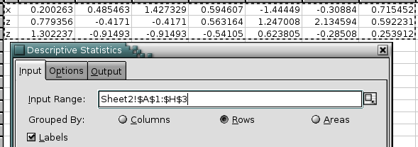
Figure 8-12 shows some example data, Figure 8-13 the selected options, and Figure 8-14 the corresponding output.
8.2.4. Frequency Tables
Gnumeric provides two types of frequencies tables:
- The frequency table tools is primarily useful for non-numeric data (data of nominal and ordinal level of measurement). It allows to determine frequencies for given values.
- The histogram tool is useful for numeric data that is supposed to be classified into a certain number of intervals. These intervals can be either specified or calculated.
- 8.2.4.1. Frequency Tables Tool
- 8.2.4.2. Histogram Tool
8.2.4.1. Frequency Tables Tool
- 8.2.4.1.1. Introduction
- 8.2.4.1.2. The “Input” Tab
- 8.2.4.1.3. The “Categories” Tab
- 8.2.4.1.4. The “Graphs & Options” Tab
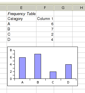
- 8.2.4.1.5. Frequency Tool Results
8.2.4.1.1. Introduction
The frequency tool can be used to create frequency tables for non-numerical data. It presents this table numerically as well as graphically.
If your data are numeric and you want to accumulate whole intervals of values into frequency counts then this tool is not appropriate. In that case you may want to use the histogram table tool described in section Section 8.2.4.2 ― Histogram Tool.
As shown in Figure 8-15, the frequency table dialog has four tabs. We will introduce them in sequence.
8.2.4.1.2. The “Input” Tab
The “Input” tab shown in Figure 8-15 contains the field specifying the data to be used for the histogram.
The “Input Range” entry contains a single range or a list of ranges, that can be grouped into variables by rows, columns, or areas.
If the first row or column of the given input ranges, or the first field of each area contains labels, the “” option should be selected. If the input is grouped by areas and the top left cell contains a label, the other cells in the first row are being ignored.
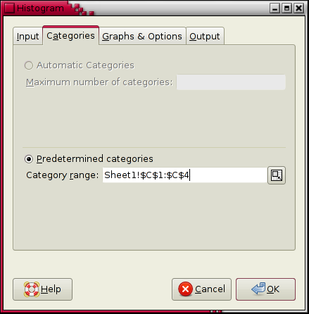
8.2.4.1.3. The “Categories” Tab
The “Categories” tab permits the specification of a range that contains the possible values that are supposed to be counted in the input range.
The “Automatic categories” option is disabled since it is not yet implemented.
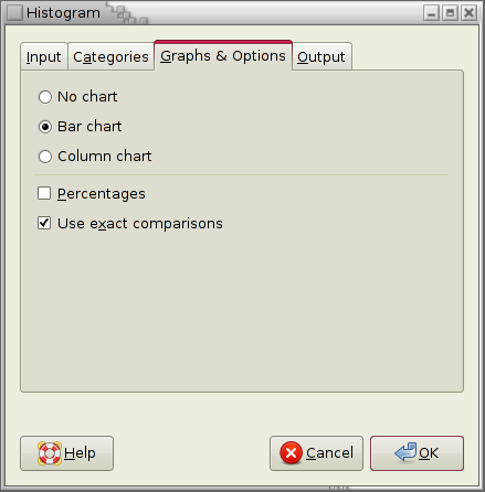
8.2.4.1.4. The “Graphs & Options” Tab
The “Graphs & Options” tab allows various options to be set. In the top half of the tab you can choose whether you would like a graph to be created. If you choose to have a graph created you can specify whether you would like to see a bar chart or a column chart.
In the bottom part of the tab you can select the “percentages” option. This option replaces the frequency counts with percentages.
If the categories range contains repeated values, then the percentages may add up to more than 100%. If the categories range does not contain all values that occur in the input range, the percentages may sum to less than 100%.
The “Use exact comparisons” checkbox determines how category values and input range values are compared. If it is checked then the function EXACT is used for the comparison. If it isn't checked then simple equality is used. In this latter case, empty cells and cells containing the numerical value 0 are considered equal. As a consequence you usually want that checkbox to be selected.
8.2.4.2. Histogram Tool
- 8.2.4.2.1. Introduction
- 8.2.4.2.2. The “Input” Tab
- 8.2.4.2.3. The “Cutoffs” Tab
- 8.2.4.2.4. The “Bins” Tab
- 8.2.4.2.5. The “Graphs & Options” Tab
- 8.2.4.2.6. The “Output” Tab
- 8.2.4.2.7. A Histogram Example
8.2.4.2.1. Introduction
The histogram tool can be used to create histograms or frequency tables for numerical data. Using this tool you can define intervals, or “bins”. The tool determines how many data points belong to each bin and presents this number numerically as well as graphically.
If your data are non-numeric this tool is not appropriate. In that case you may want to use the frequency table tool described in section Section 8.2.4.1 ― Frequency Tables Tool.
As shown in Figure 8-19, the histogram dialog has five tabs. We will introduce them in sequence.
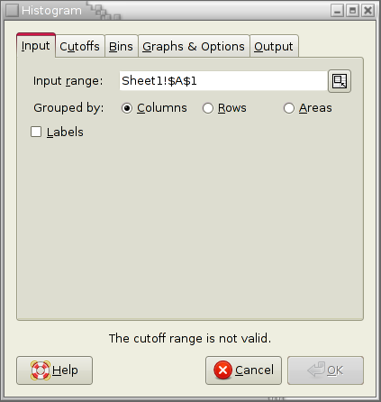
8.2.4.2.2. The “Input” Tab
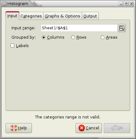
The “Input” tab shown in Figure 8-19 contains the field specifying the data to be used for the histogram.
The “Input Range” entry contains a single range or a list of ranges, that can be grouped into variables by rows, columns, or areas.
If the first row or column of the given input ranges, or the first field of each area contains labels, the “” option should be selected. If the input is grouped by areas and the top left cell contains a label, the other cells in the first row are being ignored.
8.2.4.2.3. The “Cutoffs” Tab
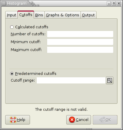
The cutoffs for the histogram can either be predetermined by data contained in your workbook or calculated by the histogram tool. These cutoffs determine bins as defined by the selection on the “Bins” tab.
Select the “Predetermined Cutoffs” option to specify data on your worksheet in the “Cutoff Range:” entry. The values in this range will be used as cutoffs c1, c2, and so on to cn.
Select the “Calculated Cutoffs” option to have the cutoffs determined by the tool. Enter the desired number of cutoffs in the “Number of Cutoffs” entry. It is strongly recommended (but optional) that you specify the minimum and maximum cutoffs in the “Minimum cutoff” and “Maximum cutoff” entries. If the minimum or maximum cutoff is not specified, the tool will use the minimum and/or maximum of the current data.
8.2.4.2.4. The “Bins” Tab
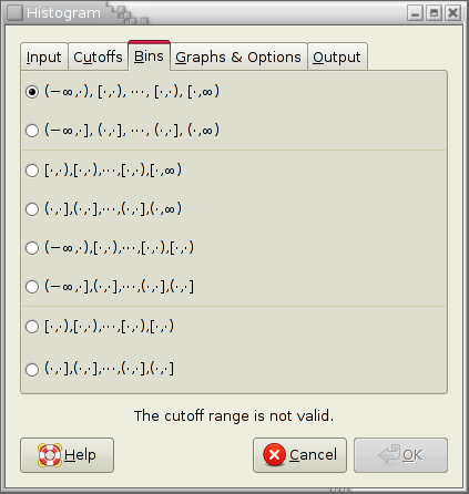
The bins tab is used to determine how the cutoffs c1, c2, and so on to cn are translated into bins. Specifically, it has to be determined whether first and/or last bins reaching from −∞ to c1 and from cn to ∞ are added and whether data points that much cutoffs exactly are included in the bin to the right or the left.
For example the option “[∙,∙),[∙,∙),⋯, [∙,∙),[∙,∞) ” indicates that the first bin starts at the first cutoff while the last bin ends at ∞. Moreover, each cutoff value belongs to the bin on its right.
8.2.4.2.5. The “Graphs & Options” Tab
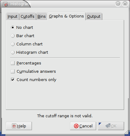
The options in the graphs and options tab specify any graph to be created and modify the appearance of the histogram:
-
The “” option causes the chart to be omitted.
-
The “” option causes a bar chart to be added to the histogram. For each bin, the bar chart shows a horizontal bar indicating the frequency.
The “” option causes a column chart to be added to the histogram. For each bin, the column chart shows a vertical bar indicating the frequency.
The “” option causes a histogram chart to be added to the histogram. For each bin, the histogram chart shows a vertical bar indicating the density (that is the frequency divided by the width of the bin).
-
The “” option causes the frequencies to be expressed as percentages.
-
The “” option causes a cumulative frequency table (either with counts or with pecentages) to be created.
-
The “” option determines whether only numbers are counted. If also non-numbers are counted they are first converted into numbers, usually into 0.
8.2.4.2.6. The “Output” Tab
The Output tab contains the standard output options and fields described in Section 8.1 ― Overview.
8.2.4.2.7. A Histogram Example
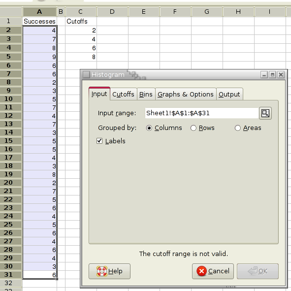
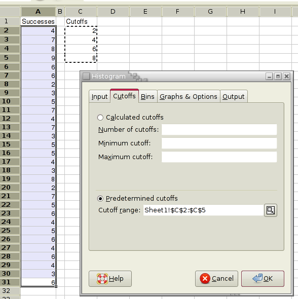
For example, you want to calculate a histogram for the number of successes in several sequences of trials. The numbers of successes are recorded in column A and the cutoffs of interest in column C (see Figure 8-23).
- Enter A1:A31 in the “Input Range:” entry of the “Input” tab by typing this directly into the entry or clicking in the entry field and then selecting that range on the sheet. In the latter case the entry may also contain the sheet name.
- Since you only have one variable select the “” or “” radio button next to “Grouped By:”.
- Select the “” option since the first cell of the Input Range contains a label.
- Enter C2:C5 in the “Cutoff Range:” entry of the “Cutoffs” tab. The “Predetermined Cutoffs” option will now also be selected (see Figure 8-24).
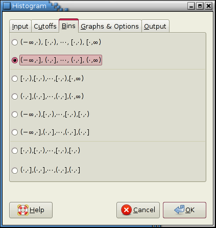
- In the “Bins” tab select the second option since we want to add two bins reaching to ∓∞ and we want to count each cutoff value in the bin to its right (see Figure 8-25).
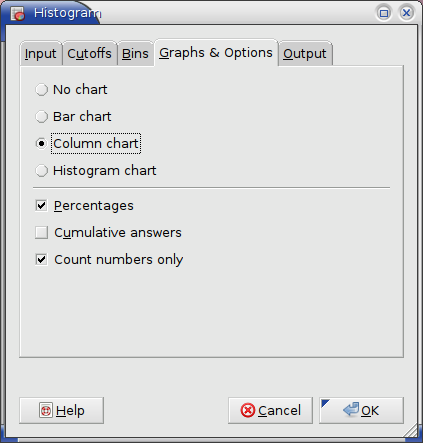
- Select the “” option of the “Graphs &Options” tab to have the frequencies expressed as percentages.
- Select the “” option of the “Graphs &Options” tab to have a column chart added to the histogram (see Figure 8-26).
- In the “Output” tab, specify the output options as described in Section 8.1 ― Overview.
- Press the OK button.
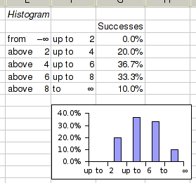
The results are shown in Figure 8-27. Note that the graph will by default appear on top of the histogram table. It usually needs to be moved in to proper position. That has already been done here.
8.2.5. Rank and Percentile Tool
Use this tool to rank given data and to calculate the percentiles of each data point.
Specify the datasets to use in the “Input Range:” entry. The given range can be grouped into datasets by columns, by rows, or by areas.
For each dataset, the tool creates three columns in the output table:
- The first column gives the indices of the ordered data from largest to smallest data value.
- The second column gives data values corresponding to the indices in the first column.
- The third column indicates the percentile of the data value in the second column.
If you have labels in the first cell of each data set, select the “Labels” option.
Figure 8-29 shows some example data and Figure 8-30 the corresponding output.
In the case of ties, the rank calculated by this tool differs from the value of the RANK function for the same data. This tool calculates the rank as it is normally used in Statistics: If two values are tied, the assigned rank is the average rank for those entries. For example in Figure 8-29 the two values 10 are the second and third largest values. Since they are equal each receives the rank of 2.5, the average of 2 and 3. The rank function on the other hand assigns the rank as it is normally used to determine placements. The two values 10 would therefore each receive a rank of 2.