Overview of Graphs
This overview will start with a brief summary of the process involved in creating a graph, then will discuss the terminology used in this document, will present the components of a graph, and present the hierarchy of the components used in to configure the graphs.
- 10.1.1. The Graph Creation Process
- 10.1.2. On Terminology
- 10.1.3. The Components of Graphs
- 10.1.4. The Graph Component Hierarchy
10.1.1. The Graph Creation Process
The process of graph creation involves several steps each of which requires the user to understand clearly what they intend to do. This outline is presented to help users understand the subsequent discussion in this document.
-
Data entry.
Before a graph can be created, the data must be entered into a workbook.
-
(Optional) Data pre-selection.
As explained in Section 10.5 ― Pre-Selecting Data, it is possible to pre-select the data and have Gnumeric correctly assign the cell contents into series names, category labels and data values. This process can only be understood once the rest of the graph creation process has been mastered so the discussion of pre-selecting data is left until the end of this section.
-
Opening the graph guru
The Graph Guru can be opened in two ways. It can be opened by clicking on the button,
 , which is on the standard toolbar
immediately to the left of the zoom box. Alternatively the
Graph Guru can be opened by using,
in the menu, the
menu item.
, which is on the standard toolbar
immediately to the left of the zoom box. Alternatively the
Graph Guru can be opened by using,
in the menu, the
menu item.
-
Configuring the graph
The Graph Guru provides the user with a large number of options to configure the graph, its charts and the plots. The first panel provides a way to select the plot type, sub-type and, for some types, a style. The second panel allows the user to configure each element of the graph. When the configuration is complete, the guru is dismissed by clicking the button. This step will be explained in detail in Section 10.2.2 ― Navigating the graph guru, below.
-
Inserting the graph
Finally, the graph is inserted into the worksheet like any other graphical element, as was explained in Section 9.1.1 ― Adding Graphical Elements.
10.1.2. On Terminology
The terminology used for describing the components of data graphs is confusing because graphs use many components and the words are applied arbitrarily to each component. For example, the words "graph", "chart", and "plot" could be used interchangeably but in Gnumeric these words are used as explained below.
The term 'graph' will be used, in this documentation, to refer to the entire graphical element placed on the worksheet. A graph has an outline and a background, may have one or more titles, and will have at least one 'chart'.
The term 'chart' will be used to denote an intermediate level element which has an outline and a background, may have one or more titles, may have a legend and will have at least one 'plot'. To support the plot, the chart may have a 'grid' area behind the plotted data, and have one or more axes.
Each 'plot' will be defined to be of a particular type when it is created. Plots will have one or more 'series' of data values which will define the magnitude of the values of to be plotted and may define a number of other related values including errors in the x and y directions.
This terminology can be used to describe in detail the components of a graph in Gnumeric. Figure 10-1 presents the components of a graph.
10.1.3. The Components of Graphs
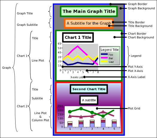
This screenshot presents several of the major components of Gnumeric graphs. These components will be presented next in their containment hierarchy. The hierarchy is used in the Graph Guru to organize the components so a user can change all the preferences.
10.1.4. The Graph Component Hierarchy
The components that make up a graph in Gnumeric are arranged in a hierarchy with all the configurable options of the graph assigned as properties to one of the components in the hierarchy.
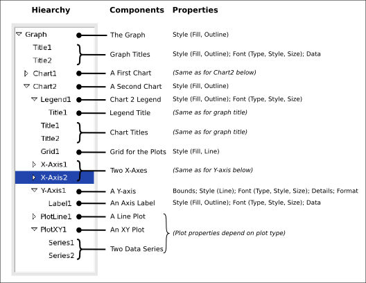
The hierarchy of graph component elements and the associated properties. In this case, the element 'X-Axis2' is selected.
In Gnumeric, Graphs are the top level element containing all the other components. Graphs have two properties related to the style of the background rectangular panel, its fill and its outline. Graphs can hold one or more titles and one or more charts.
Titles have the same properties related to their background rectangular panel, the fill and outline, have properties related to the text, the font type, style, and size, and have the text data that will be the title itself.
Charts have the same properties related to the background rectangular panel and can contain a number of other components including their own titles, a legend, plot accessories and plots.
Legends have the same properties related to their background rectangular panel and also have the properties related to the font in which the name of each series will be added to the legend, the font type, style, and size.
Certain plot types require accessory components such as the elements related to the creation of a Cartesian coordinate system. Charts which include one or more plots of this kind will have a Grid and may have X (horizontal) and Y (vertical) axes.
Grids are the background of Cartesian plots and have the properties determining the fill of this area and the line pattern displayed behind the plotted series.
Axes have properties related to the outer bounds of the axis, the style of the line drawn for the axis, the font style of the markers along the axis, detail properties of the tics and other markers on the axis, and the number format of the axis markers.
Axis labels share the same properties related to the style of their background rectangular panel, including the fill and outline properties, have properties related to the style of the font used for the text, including the font type, style and size, and the data contents of the text used to label the axis.
The properties of each type of plot, and of the data series they contain, vary depending on the actual type of the plot. For instance, the values of a data series which are plotted as a pie plot will not have any associated error values, whereas values plotted as columns could be associated to Y-error values and values plotted as an XY scatterplot could be associated with error values in both the X and the Y direction. Obviously, these different plot types will require different options. The options associated with each specific plot type will be discussed below, in Section 10.4 ― Configuring Graph Element Properties.