Configuring Graph Element Properties
Graphs in Gnumeric can be configured extensively using the Graph Guru. In this way, the user can determine the data used in the plots, the names and labels associated with the data, the numerical values of the axes and the stylistic presentation of all the graphical elements.
Graphs are configured element by element, first by selecting the element name in the top left area of the second panel of the Graph Guru, shown as area in Figure 10-3, and, second, by altering the properties in the bottom area of the second panel of the Graph Guru, shown as area . These changes will be applied to the graph only when the button is pressed.
A number of properties of the graph are configured using the Gnumeric entry box shown in Figure 10-15.
Information can be inserted to the data entry box, first, by selecting the box with a mouse click and, then, either typing data on a keyboard or using the mouse to select a region of the worksheet.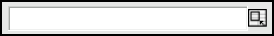
- 10.4.1. Background Panels: Graphs & Charts
- 10.4.2. Titles and Axis Labels
- 10.4.3. Chart Legends
- 10.4.4. Axes
- 10.4.5. Plots
- 10.4.6. Data Series
10.4.1. Background Panels: Graphs & Charts
Several elements of the graph function as background panels for the other elements. These panels can be configured to display a visible background consisting of a solid color, a pattern, a gradient, or an image. Alternatively, the panel can be made transparent to show the underlying panel, if any. Where there are only transparent panels, the worksheet itself will be visible behind the graph.
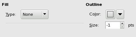
This screenshot depicts the two elements of background panels which can be configured, the background fill and the outline.
The background panel Fill refers to the area which is behind the entire component. The Outline refers to a solid box which will be drawn around the edge of the component.
The Outline can be configured by selecting a color using the color picker widget and by choosing a size using the spin button box. A size of '-1' indicates that no line will be drawn, whereas sizes zero and above indicate the size of the line that will be drawn.
The Fill can be configured to be a pattern, which includes a solid color, a gradient or an image.
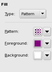
This screenshot depicts the configuration properties for the pattern background panel fill.
The fill using a pattern enables the panel background to consist either of a solid color, or of a solid color overlain by a pattern. The top drop down button, labeled Pattern, allows the user to select the pattern overlay from a number of different standard patterns. The pattern in the top left corner is an empty pattern which allows the background color indicated in the third drop down button to fill the panel. The middle drop down button, labeled Foreground, allows the user to select the color of the overlay in the pattern. The bottom drop down button, labeled Background, allows the user to select the color of the underlay. If the pattern is empty, the color of the Background will be the color of the entire panel.
If all of these buttons appear black, change the color of the Background to white to see the pattern and foreground color.
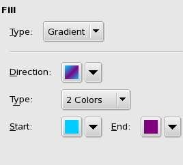
This screenshot depicts the configuration properties for the gradient background panel fill.
The background panel can be filled with a gradient transitioning either between two colors or between a color and a tone, either white or black. The top drop down button, labeled Direction, gives the user a number of choices for the direction in which the gradient will operate. The drop down button named Type allows the user to pick between gradients which transition between two colors, the 2 Colors option, and gradients that transition from a color to pure white or pure black, the Brightness option. The drop down buttons for the Start and End colors allow the user to pick the colors in the gradient. For the brightness gradients, a slider allows the user to select the transition direction. Moving the slider toward Brighter will fade the color to white whereas moving the slider toward Darker will fade the color toward black.
If all of these buttons appear black, change the color of the Start button to white to see the gradient.
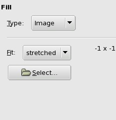
This screenshot depicts the configuration properties for the image background panel fill.
The image background fill type allows the user to select an image to fill the background of the panel. The image can be in any file format supported by the gdk-pixbuf library as explained in Section 9.2 ― Images. The image can be fit in one of two ways. The image fit can be stretched so the image fills the whole panel area or the image fit can be wallpapered where the image is repeated in a tile pattern to fill up the whole background. The button labeled Select allows the user to call the file selector and choose the file which contains the desired image. On the GNOME desktop, the file chooser has a preview area to see the image before adding it. The size of the image, in pixels, is displayed in the configuration dialog as '# x #' where the number symbol indicates the number of pixels, and the number of pixels in each row comes before the number in each column.
10.4.2. Titles and Axis Labels
Both Title and Axis Labels can be configured using three tabs. The first tab allows the user to configure the background panel of the title or axis label. The second tab allows the user to select the font that will be used to display the words in the title or axis label. The third tab allows the user to input the actual words which will be used in the graph.
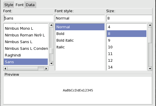
This screenshot depicts the font configuration panel for titles and axis labels in the Graph Guru.
The Style tab allows the user to configure the background panel in the same way this was configured for graphs, charts and grids, as was explained above in Section 10.4.1 ― Background Panels: Graphs & Charts.
The Font tab is shown in Figure 10-20 and consists of three column lists. The first column list allows the user to select the font name by scrolling the list and then clicking on the desired name. The currently selected font name is highlighted in light blue. The second column list allows the user to select the font style including italic and bold styles. The third column list allows the user to select a size for the font. The preview area contains a few characters to illustrate the appearance of the currently selected combination.
The Data tab displays a single entry box in which the user can place the words which will appear in the title or in the label. The user can simply type the text, can add a reference to a section of the worksheet or can add an expression which results in a text value.
10.4.3. Chart Legends
Chart legends provide a graphical explanation of the data plotted with the names and style of the different series, or categories, plotted in each chart. Legends are configured through two tabs, labeled Style and Font. The Style tab allows for the configuration of the background pane in a manner analogous to the graph, chart and grid background panes, explained in Section 10.4.1 ― Background Panels: Graphs & Charts. The Font tab allows the configuration of the font that will appear in the legend. This configuration is identical to the configuration of the title and axis label fonts presented in Section 10.4.2 ― Titles and Axis Labels.
10.4.4. Axes
Axes are used in several different kinds of plots to provide quantitative indexes for the scale of each plot direction. Gnumeric uses four different kinds of axes. Category axes do not provide a quantitative scale but merely distinguish each different category by providing space for the values of the category along the axis. Continuous axes provide a quantitative measure of each value based on the projection of that value onto the axis. Radial axes are used in radar plots and are continuous axes which radiate from a central point. Circular axes have not yet been implemented.
Line, column and area charts use a category axis to separate the categories along the horizontal direction and a continuous axis to distinguish values in the vertical direction. Bar charts reverse these two axes. XY scatter plots and bubble plots use two continuous axes, one in the horizontal direction, the X-axis, and one in the vertical direction, the Y-axis. Radar plots use three or more continuous axes radiating from a central point. Pie and Ring plots do not use any axes.
- 10.4.4.1. Category Axes
- 10.4.4.2. Continuous Axes: Linear, Radial & Circular
- 10.4.4.3. Grids
10.4.4.1. Category Axes
Category axes distinguish the different categories of each value in a category series such as the series in line, bar, column and area plots.
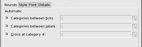
The Bounds tab allows the user to override the automatic configuration of axis tick marks and labels. Each of the three choices can be over-ridden by deselecting the check box on the left. The check boxes can be deselected by placing the mouse pointer over the check box and clicking with the primary mouse button. When a check box is unselected, the entry box will become active allowing the user to input a different value than the default. The first check box controls the number of tick marks, allowing tick marks to appear after the integer number of categories shown. The second check box controls the number of labels displayed, allowing a regular number of category labels to be skipped. The third check box controls the placement of the orthogonal axis relative to the category axis.
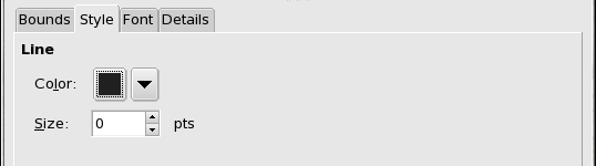
The Style tab allows the user to configure the line style of the axis, including the color and thickness of the line. The drop down button labeled Color can be clicked to expose the color picker panel which allows the user to select a new color either simply by clicking on an icon or by using the color picker wheel. The size spin button allows a user to change the thickness of the axis by typing a new number in the text box or by clicking on the arrows. A value of '-1' in this box will cause the axis not to be drawn.
The Font tab allows the user to configure the font used to label the separate categories. The font configuration is performed in the same way as the font configuration for titles and axis labels which was explained in Section 10.4.2 ― Titles and Axis Labels.
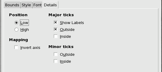
The Details tab allows a user to configure other aspects of the axis.
The Position of the axis is placed in the Low position by default. This can be altered by pressing the radio button in front of the High label which will move the internal button and will alter the position of the axis, moving it either to the top of the graph for horizontal axes, or to the right of the graph for vertical axes.
The Mapping of the axis can be changed simply by clicking on the check box. This will cause a check mark to appear in the box and will invert the axis so that the order of the categories will become reversed.
The Major ticks displayed on the axis can be altered. The labels shown in the plot can be hidden by unchecking the check box in front of the 'Show Labels' text by placing the mouse cursor over the box and clicking with the primary mouse button. The ticks on the axis can be hidden or can be displayed on the outside of the graph, or on the inside of the graph, or on both sides depending on which of the two boxes are checked.
The Minor ticks do not currently have any effect for category axes.
10.4.4.2. Continuous Axes: Linear, Radial & Circular
Continuous axes are configured in much the same way as category axes except for some minor differences.
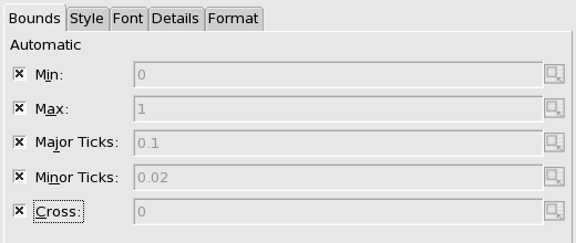
The Bounds tab allow users to configure the limits and intervals of a continuous axis. The meaning of the values for Major Ticks and Minor Ticks depends on the type of continuous axes:
- Continuous Axes with Linear Scale
-
The Major Ticks value gives the distance between major ticks and the Minor Ticks value the distance between minor ticks.
- Continuous Axes with Logarithmic Scale
-
The Major Ticks value gives the number of decades (powers of 10) between major ticks. The Minor Ticks value gives the number of minor ticks between major ticks.
If the Major Ticks value is N, then the Minor Ticks value can be 0, N−1, or 9N−1.
The Style tab changes the linear style of the axis in the same way as it acted on category axes. The explanation given in Section 10.4.4.1 ― Category Axes apply equally well to continuous axes.
The Font tab also allows users to configure the font used in the numeric markers along the axis. Selecting the font for a continuous axis works in the same way as for a category axis as was explained in Section 10.4.4.1 ― Category Axes.
The Details tab has two small differences compared to category axes. The mapping of the axis can be altered from a linear scale to a logarithmic scale by clicking on the drop down box and dragging to the entry labeled . The minor ticks, whose size was configured in the Bounds tab, are displayed for continuous axes unlike for categorical axes.
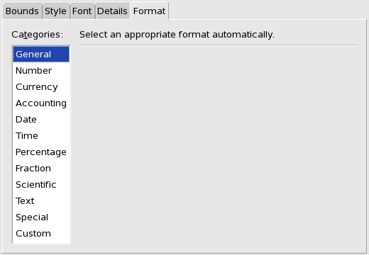
The Format tab allow users to configure the numeric type of the elements on a continuous axis. This configuration parallels the configuration of the numeric type of a worksheet cell as explained in Section 5.10.1 ― Number Formatting Tab.
10.4.4.3. Grids
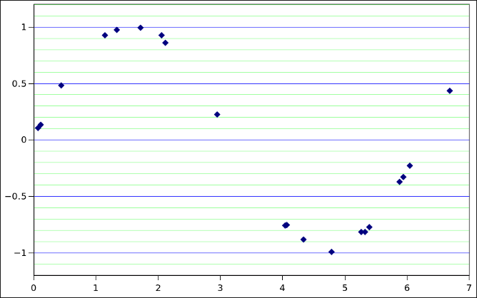
Users can add both major and minor grids to an axis. Grids are lines that are perpendicular to the axis at fixed intervals. An example of major (in blue) and minor (in green) grids attached to a vertical axis are shown in Figure 10-26.
To add either a major or minor grid to an axis, the user selects the appropriate axis in the hierarchy tree of graph components, clicks the button below the hierarchy, and selects either or .
When a grid has been added to an axis, it can be selected in the hierarchy tree of graph components and customized in its configuration tab. One can specify the style, color, and thickness (size) of the grid lines as well as specify a fill to be applied to the space between every second pair of consecutive grid lines.
10.4.5. Plots
Certain of the properties of plots are assigned directly to the plot element and are configured when the plot element itself is selected.
Line plots, Area plots, and XY scatter plots do not have any plot level properties which can be configured.
- 10.4.5.1. Bubble plots
- 10.4.5.2. Pie plots
- 10.4.5.3. Bar and Column plots
- 10.4.5.4. Radar plots
- 10.4.5.5. Ring plots
10.4.5.1. Bubble plots
The bubbles in bubble plots are used to represent a third data component with the size of the bubble representing the value of the third component.
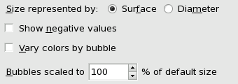
The first choice in the bubble plot properties allows the user to represent the bubble value based on the area or the diameter of the bubble. The representation of a bubble using the surface is similar to using a log scale since the area is a squared quantity.
The Show negative values property, if the check box is checked, will cause negatives values to be shown with the size of the bubble based on the absolute value of the value and the style of the bubble having a white fill.
The Vary colors by bubble, if the check box is checked, will cause each value in a series to be displayed with a different fill color instead of coloring all the values in a single series with the same color.
The bubbles in a series are scaled relative to each other with the maximum value having a default, fixed size and the other values being scaled to this maximum bubble. Using this spin button, the default size of the maximum bubble can be altered.
10.4.5.2. Pie plots
Pie plots represent the data values as slices of a circular area, with the central angle of each slice, or wedge, proportional to the size of the value compared to the sum of all the values in the series.
The slices by default are plotted clockwise starting from the vertical which is considered 0 degrees. The first option allows the user to set a different starting point for the pie series by changing the value in the spin box. The value will increase to 360 degrees and then reset to zero.
Pie plots can be displayed with the slices separated from each other which in certain situations may improve the visual clarity of a pie plot. The second spin button allows the slices to be separated.
The colors of each slice, by default, are all different to allow the easy visual distinction between each slice. Since pie plots only allow a single series to be plotted, there is no need to use color to associate the values from different series. By unchecking this box, all of the slices in a pie chart can be made to follow the color scheme defined in the plot series Style tab. However, if this box is unchecked, the outlines of the slices must be styled with a different color for the slices to be distinguishable.
10.4.5.3. Bar and Column plots
Bar and column plots can be displayed with different sized gaps between categories and different overlaps between the values of different series in each category.
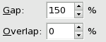
The Gap describes the separation between the values plotted in each category. By default, the gap between categories is one and half times the width of a bar or a column. This spin button can be used to decrease the gap to zero, so there is no gap between categories, or increase the gap to 500% so the gap is five times the size of a bar or a column.
The Overlap describes the separation between values of the different series in each category. By default these values will be plotted immediately adjacent to each other. This spin button can be lowered to minus 100% which leaves a gap the size of a bar or column between the values of each series. Alternatively, the values can be made to overlap up to 100%, a complete overlap. When values completely overlap, the latter series are plotted on top of the first series and a value may be completely obscured. In this case it may be possible to use partially transparent colors for the different series to allow both values to be visible.
10.4.5.4. Radar plots
Radar plots have as many axes as there are categories in each series.
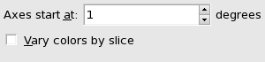
By default the axis for the first category is vertical leaving the center point in the upward direction. The first spin box in the radar plot properties allows a user to change this orientation. The spin button can increase from zero degrees to 359 degrees when it will reset to 0.
The Vary colors by slice property is probably a mistake which should not be part of radar plot properties.
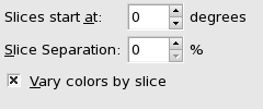
10.4.5.5. Ring plots
Ring plots are similar to pie plots but may have an empty center and can be made with multiple series.
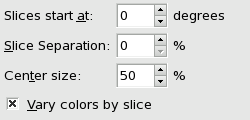
Like pie plots, ring plots assign values to the slices of a circular area by representing the magnitude of the value by the central angle of the slice, although for ring plots the center of the circular area is empty. Like pie plots, the first slice is plotted starting clockwise from the vertical and this first option can change the beginning point of the first slice's angle.
The slices of a ring plot can also be separated. The Slice Separation option allows a user to determine the proportional size of the gap between slices.
The Center size option determines the size of the hole in the middle of the rings as a fraction of the total radius. The center size can be altered in 5 percent increments.
The Vary colors by slice check box allows the user to assign colors either by slices, which is the default, or by series. To use color to distinguish series rather than categories, this button should not be checked.
10.4.6. Data Series
Each plot will have one or more 'series' which organize the data values. Each series element has a number of properties. The element will have a Style tab with which the style of the line and point markers, or the area and outline can be set. Each series element will have a Data tab in which the name of the series, the values used for the series and any labels associated with these values can be entered. The data values will generally be entered as references to cells on a worksheet which will allow the plots to be automatically altered when the values in the worksheet change. The series may also have one or more Error tabs in which error values can be associated to the data value of each element in the series.
- 10.4.6.1. Series line style
- 10.4.6.2. Series filled style
- 10.4.6.3. Series data: single values
- 10.4.6.4. Series data: X and Y values
- 10.4.6.5. Series data: bubble values
- 10.4.6.6. Series error values
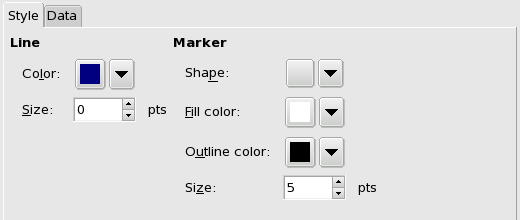
10.4.6.1. Series line style
Series in line plots, in some radar plots and in scatter plots will have a style tab in which the graphical style of the lines and point markers can be established.
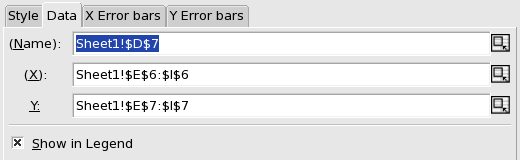
The properties of a single value data series include an optional name, a required list of values and an optional list of labels. The name, in this case, is a reference to cell D7 in the first worksheet. The values are the contents of the cells in the range E7:I7. The labels are the contents of the cells in the range E6:I6. Note that there are as many cells in the labels range as in the values range.
The Line properties include the line color and size. The color can be altered in the standard way using the drop down color chooser. The width of the line can be changed with the spin box. A line size of '-1' means that the line will not be plotted.
The Marker properties determine the style of the graphical symbol which will be plotted for each data value. The first drop down box allows the user to choose between a number of different symbols. The blank symbol indicates that no symbol will be plotted where the data value would be. Each shape will have a fill color, and an outline with both a color and a size. The colors can be changed by clicking on the drop down box and picking one of the given colors or using the color picker to select a new color. The size of the outline can be altered by clicking in the text area and editing the value or by using the spin arrows to increase or decrease the size.
10.4.6.2. Series filled style
Series in bubble plots, area plots, bar plots, column plots, filled radar plots, and ring plots will have a Style with fill and outline properties. These properties are the same as those presented for background panels in Section 10.4.1 ― Background Panels: Graphs & Charts and are changed in the same way.
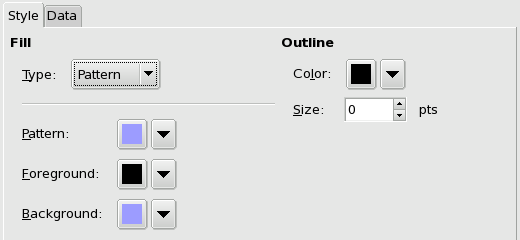
The Fill properties will determine the character of the inside of the area. The fill type can be none, pattern, gradient, or image, in the same way as the fill of background panels. If images are used for the background, the whole image will be shown and it will be scaled to the size of the area.
The Outline properties will determine the size of the linear element that surrounds the area. The color and size of this outline element can be altered.
10.4.6.3. Series data: single values
The Data tab allows the user to configure the data contents of the series. Some of these data contents are optional, as is indicated by the parentheses around the label. At the minimum one set of numerical quantities will be required.
The entry boxes in the Data tab can be filled in several ways. The data can be a static value or array such as a sting literal, "SeriesName", or a group of values, {12.05, 73.02, 128.89}. Note that the separator between elements in the array will depend on the locale since the glyph between whole numbers and decimal fractions differs around the world. Alternatively, the value of an entry box can be the reference to a cell or to a range. This reference can either be typed into the entry box or can be entered by clicking in the entry box text area and then selecting the range on the worksheet. Finally, the value in the entry box can be an expression, such as sin({120, 982, 140}).
Single series involve the simplest data. They may have an overall name, must have a list of values, and may have a list of names, with as many names as there are numbers in the values list, which will act as category names. For plot types with more than one single list series, the label names will be shared between all the series.
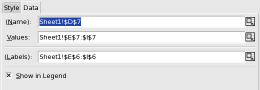
The Name property is a single string which will give a tag to the series itself. A name is not required. This name will be used in the Graph Guru to name the series and may be used in a chart legend to describe the series.
The Values property must contain a list of numeric quantities. A list of values is required. The values can be described either directly as a static array, described through a reference to a cell range with numeric values, or described through an expression which results in the list of quantities.
The Labels property describes the names of the categories. This property is not required. must be a list of text elements, with as many elements as there are quantities in the list of values. These elements will provide the elements in the legend for pie and ring plots. For line, area, bar and column plots, the labels will provide the category names for the axis with categories.
The Show in Legend property determines if this series will be shown in the legend if a legend is added to the chart. It is sometimes useful to exclude certain series from the legend. If the box is checked, the series will be included in any legend displayed in the chart; if the box is not checked, the series will not be displayed in the legend. The box can be unchecked by placing the mouse pointer over the box and clicking with the primary mouse button.
10.4.6.4. Series data: X and Y values
Series with dual data values allow plots to be constructed in which one value is plotted against the other. XY scatter plots require this type of data.
Dual data series require two sets of values, an X list and a Y list.
The Name property is a single text element that will name the series in the graph guru and in any legend in the chart.
The X property is a list of quantitative values that will provide the horizontal positioning of each element. This list is required.
The Y property is a list of quantitative values that will provide the vertical positioning of each element. This list is required and must have the same number of elements as the list of X values.
10.4.6.5. Series data: bubble values
Bubble series are simple extensions of the XY series to include a third data value, often called W, which will determine the size of the bubble.
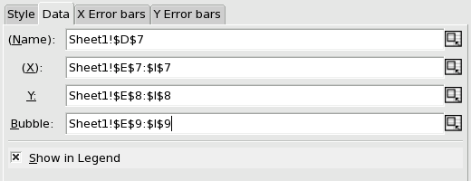
The Name property is a single text element that will name the series in the graph guru and in any legend in the chart.
The X property is a list of quantitative values that will provide the horizontal positioning of each element. This list is required.
The Y property is a list of quantitative values that will provide the vertical positioning of each element. This list is required and must have the same number of elements as the list of X values.
The Bubble property is a list of quantitative values that will provide the size of the bubbles associated to each element. This list is required and must have the same number of elements as the lists of X and of Y values.
10.4.6.6. Series error values
Several plot types allow the plotting of error values using whisker plots. The series in these plot types will have extra tabs allowing the whisker positions to be listed. Line, bar, column and area plots allow an error plot to bracket the plotted quantitative value in the direction of the quantitative axis. XY scatter plots and bubble plots allow whiskers in both directions.
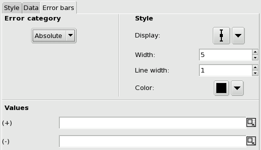
The Error Category includes several different categories which can be selected by clicking on the drop down box and dragging the mouse pointer onto the appropriate entry. If the error category is set to "none", no error bars will be plotted. If the category is set to "absolute" the values in the error lists will be considered to be in the same units as the axis. If the category is set to "relative", the values in the error list are assumed to be a fraction of the total of each value. If the category is set to "percent", the values in the error list are assumed to be 1/100 th of the fraction of the total of each value. Note that if the cells in the worksheet are already set to the percent format, they should be incorporated as "relative" errors.
The Style properties alter the appearance of the error whiskers. The Display property can be used to prevent the display of any whiskers, to allow only upper or lower whiskers, or to display both. The Width property alters the width of the outer marker of the whisker. The Line width property alters the size of the whiskers. The color box selects the color of the line used to draw the whiskers.
The Values properties describe the lists of quantitative values which will be used for the whiskers. These lists are required if an error is to be displayed and the lists must have as many elements as were in the list of data "Values". The positive (+) list quantifies either only the upper error values if the lower values are not displayed or the negative list is defined. The positive list can also be used for both error values if the errors are symmetrical. The negative (-) list quantifies the lower whisker.