Plot Types
Gnumeric graphs can include any of the plot types presented below. The section for each type explains the overall concept of the plot, gives an example, explains the data required for the plot type, and explains the icons in the Graph Guru which allow setting the plot sub-type and style.
- 10.3.1. Area Plots
- 10.3.2. Bar Plots
- 10.3.3. Bubble Plots
- 10.3.4. Colored XY Plots
- 10.3.5. Column Plots
- 10.3.6. Contour Plots
- 10.3.7. DropBar Plots
- 10.3.8. Line Plots
- 10.3.9. Min-Max Plots
- 10.3.10. Pie Plots
- 10.3.11. Polar Plots
- 10.3.12. Radar Plots
- 10.3.13. Ring Plots
- 10.3.14. Statistics Plots
- 10.3.15. Surface Plots
- 10.3.16. XY Scatterplots
10.3.1. Area Plots
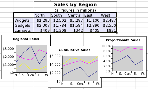
Area plots present the numeric values of categorical data with the data values of each series connected by a line and the area below the line shaded. This type is directly analogous to the line plot type. Sequential data values are considered to belong to different categories and are plotted along the horizontal axis at equally spaced intervals. The data values from different series are assigned to these categories based on the position of the value in the series, for example, the second data value taken from each series all share one category. The data values are plotted along the vertical (Y) axis according to their numeric value and the particular sub-type chosen for the area plot.
Area plot sub-types provide three options for relating the values from different data series. The first sub-type plots each series independently with the data value determining the vertical distance between each point and the horizontal axis. The second sub-type plots the series stacked on each other in a cumulative fashion with the data value of each series determining the vertical distance from the point to the sum of the values in all the previous series. For example, if the first series starts with values {3.9, 4.2, ...}, the second series with values {1.2, 3.5, ...}, and the third series with values {3.1, 1.9, ...}, then the point value for the second element of the third series will be plotted at 9.6 (since 9.6=4.2+3.5+1.9) along the vertical axis. The third sub-type plots each series based on the proportional contribution of the value to the total of all values in that category. Using the example above, the three values would be plotted at 0.4375, 0.8020, and 1 because the intervals between zero and each of these numbers is 0.4375=4.2/(4.2+3.5+1.9) for the first, 0.3645...=3.5/(4.2+3.5+1.9) for the second, and 0.1979...=1.9/(4.2+3.5+1.9) for the third, although, by default, these numbers are presented as percentages on the vertical (Y) axis.
Area plots do not have any pre-defined styles.
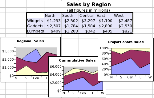
This screenshot shows a table of data and three area plots. The data consist of three series organized by row and starting with the words "Widgets", "Gadgets", and "Lumpets". Each of these series has values in five categories. The three graphs illustrate the three sub-types of area plots, with the series plotted independently in the left plot, stacked in the middle plot, and proportionately stacked in the right plot.
Each series in area plots can include three main elements and two error elements, although only the value element is necessary. The series can have a 'Name' element, which is a single text entry used to identify the series, must have a 'Values' element, which is a sequence of numeric values, and may have a 'Label' element, which is a sequence of text entries used to identify the categories. All of these elements can be defined as references to a region of the worksheet, as literally defined entries, or as formula expressions which result in the correct type. The 'Label' element is shared by all of the series. The legend added to an area plot identifies the different series, by default using the entries of the 'Name' element of each series. The two error elements include a list for errors in the positive direction and one for errors in the negative direction.
| Element | Type | Example |
|---|---|---|
| Name | A single textual element labeling the data series. These will be used in the legend which may be displayed with the area plot. | {"Widgets"} |
| Value | A series of numeric values. | {1293, 2502, 3297, 1100, 2487} |
| Label | A series of textual elements labeling each value. Generally, this series will have as many entries as there were in the "Value" series. These entries are shared by all the series in the area plot. | {"North", "South", "Central", "East", "West"} |
| Error (+) | A list of numeric values with as many elements as there were in the 'Value' list. These values can be in the same units as the numeric values in the 'Value' list, can be proportions or can be proportions multiplied by one hundred. | {0.10, 0.12, 0.09, 0.11, 0.09} |
| Error (-) | A list of numeric values with as many elements as there were in the 'Value' list. These values can be in the same units as the numeric values in the 'Value' list, can be proportions or can be proportions multiplied by one hundred. | {0.08, 0.11, 0.10, 0.09, 0.11} |
Area plots provide three icons to choose one of the three area plot sub-types.
-

-
The icon for an area plot of the sub-type with independent, overlapping areas.
-

-
The icon for an area plot of the sub-type with stacked areas.
-

-
The icon for an area plot of the sub-type with stacked, proportionate areas.
10.3.2. Bar Plots
Bar plots present the numeric values of categorical data with the data values of each series represented as a horizontal bar. Sequential data values are considered to belong to different categories and are plotted along the vertical axis at equally spaced intervals. The data values from different series are assigned to these categories based on the position of the value in the series, for example, the second data value taken from each series all share one category. The data values are plotted along the horizontal (X) axis as bars of different lengths and positions depending on the numeric content of the data value and the particular sub-type chosen for the bar plot.
Bar plot sub-types provide three options for relating the values from different data series. The first sub-type plots each series independently in adjacent bars, each of which is tied to the vertical axis and has its length determined by the numeric content of the data value. The second sub-type plots each series as a horizontally stacked set of bars with the horizontal length of each element determined by the numeric content of the data value and the position of the bar determined by the position of the element in the data series. For example, if the first series starts with values {3.9, 4.2, ...}, the second series with values {1.2, 3.5, ...}, and the third series with values {3.1, 1.9, ...}, then the third bar will be plotted ranging from 7.7 to 9.6, since 7.7=4.2+3.5 and 9.6=4.2+3.5+1.9. The third sub-type plots each series as a horizontally stacked set of bars scaled to the total all the numeric values in that category. Using the example above, the three bars would range from 0 to 0.4375, from 0.4375 to 0.8020, and from 0.8020 to 1 respectively because the intervals are the proportional contribution of each data value to the total, i.e. 0.4375=4.2/(4.2+3.5+1.9) for the first, 0.3645...=3.5/(4.2+3.5+1.9) for the second, and 0.1979...=1.9/(4.2+3.5+1.9) for the third. By default, these numbers are presented as percentages on the horizontal (X) axis.
Bar plots do not have any pre-defined styles.
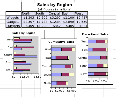
This screenshot shows a table of data and three bar plots. The data consist of three series organized by row and starting with the words "Widgets", "Gadgets", and "Lumpets". Each of these series has values in five categories. The three graphs illustrate the three sub-types of bar plots, with the series plotted independently in the left plot, stacked in the middle plot, and proportionately stacked in the right plot.
Each series in bar plots can include three main elements and two error elements, although only the value element is necessary. The series can have a 'Name' element, which is a single text entry used to identify the series, must have a 'Values' element, which is a sequence of numeric values, and may have a 'Label' element, which is a sequence of text entries used to identify the categories. All of these elements can be defined as references to a region of the worksheet, as literally defined entries, or as formula expressions which result in the correct type. The 'Label' element is shared by all of the series. The legend added to a bar plot identifies the different series, by default using the entries of the 'Name' element of each series. The two error elements include a list for errors in the positive direction and one for errors in the negative direction.
| Element | Type | Example |
|---|---|---|
| Name | A single textual element labeling the data series. These will be used in the legend which may be displayed with the bar plot. | {"Widgets"} |
| Value | A series of numeric values. | {1293, 2502, 3297, 1100, 2487} |
| Label | A series of textual elements labeling each value. Generally, this series will have as many entries as there were in the "Value" series. These entries are shared by all the series in the bar plot. | {"North", "South", "Central", "East", "West"} |
| Error (+) | A list of numeric values with as many elements as there were in the 'Value' list. These values can be in the same units as the numeric values in the 'Value' list, can be proportions or can be proportions multiplied by one hundred. | {0.10, 0.12, 0.09, 0.11, 0.09} |
| Error (-) | A list of numeric values with as many elements as there were in the 'Value' list. These values can be in the same units as the numeric values in the 'Value' list, can be proportions or can be proportions multiplied by one hundred. | {0.08, 0.11, 0.10, 0.09, 0.11} |
Bar plots provide three icons to choose one of the three bar plot sub-types.
-

-
The icon for a bar plot of the sub-type with independent, adjacent bars.
-

-
The icon for a bar plot of the sub-type with horizontally stacked bars.
-

-
The icon for a bar plot of the sub-type with horizontally stacked, proportionately scaled bars.
10.3.3. Bubble Plots
The data values from three series of equal length are plotted on the Cartesian (X-Y) plane, the value from the first series determining the position of the plotted symbol center along the X axis, the value from the second series determining the position of the plotted symbol center along the Y axis, and the value of the third series determining the radius of the circle plotted. Each triplet of series can be plotted with different symbols but the data values of any series can be shared.
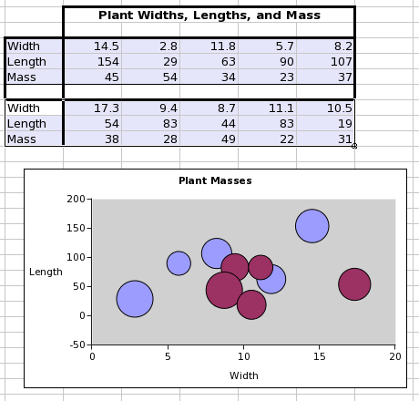
This screenshot shows a worksheet with a table of data with two series, each with three lists of numeric values. The screenshot also shows a bubble plot made from these two series.
Each series in a bubble plot can include four main components and four optional error components. The series may have a name, a single text value which will identify the series in the graph guru and in any legend attached to the chart. The series must have two lists of quantitative values, a list of X values and a list of Y values, which must have an equal number of elements. The series must also have a list, with the same number of elements, whose values will determine the size of the circles drawn at each point. The series may have lists of error components for the X values or the Y values and for positive or negative errors.
| Element | Type | Example |
|---|---|---|
| Name | A single textual element labeling the data series. | {"Series1"} |
| X | A list of numeric values, which will place the values along the horizontal axis. | {14.5, 2.8, 11.8, 5.7, 8.2} |
| Y | A second list of numeric values, which will place the values along the vertical axis. | {154, 29, 63, 90, 107} |
| Bubble | A series of numeric values, which will determine the size of each circle drawn at the points. | {45, 54, 34, 23, 37} |
| X Error (+) | A list of numeric values with as many elements as there were in the 'X' list. These values can be in the same units as the numeric values in the 'X' list, can be proportions or can be proportions multiplied by one hundred. | {0.10, 0.12, 0.09, 0.11, 0.09} |
| X Error (-) | A list of numeric values with as many elements as there were in the 'X' list. These values can be in the same units as the numeric values in the 'Value' list, can be proportions or can be proportions multiplied by one hundred. | {0.08, 0.11, 0.10, 0.09, 0.11} |
| Y Error (+) | A list of numeric values with as many elements as there were in the 'Y' list, and therefore in the 'X' list. These values can be in the same units as the numeric values in the 'Y' list, can be proportions or can be proportions multiplied by one hundred. | {0.09, 0.11, 0.10, 0.12, 0.09} |
| Y Error (-) | A list of numeric values with as many elements as there were in the 'Y' list, and therefore in the 'X' list. These values can be in the same units as the numeric values in the 'Y' list, can be proportions or can be proportions multiplied by one hundred. | {0.10, 0.09, 0.08, 0.11, 0.11} |
Bubble plots have a single icon for the plot style.
-

-
The icon for a bubble plot.
10.3.5. Column Plots
Column plots present the numeric values of categorical data with the data values of each series represented as a vertical column. Sequential data values are considered to belong to different categories and are plotted along the horizontal axis at equally spaced intervals. The data values from different series are assigned to these categories based on the position of the value in the series, for example, the second data value taken from each series all share one category. The data values are plotted along the vertical (Y) axis as columns of different heights and positions depending on the numeric content of the data value and the particular sub-type chosen for the column plot.
Column plot sub-types provide three options for relating the values from different data series. The first sub-type plots each series independently in adjacent bars, each of which is tied to the horizontal axis and has its height determined by the numeric content of the data value. The second sub-type plots each series as a vertically stacked set of columns with the vertical height of each element determined by the numeric content of the data value and the position of the column determined by the position of the element in the data series. For example, if the first series starts with values {3.9, 4.2, ...}, the second series with values {1.2, 3.5, ...}, and the third series with values {3.1, 1.9, ...}, then the third column will be plotted ranging from 7.7 to 9.6, since 7.7=4.2+3.5 and 9.6=4.2+3.5+1.9. The third sub-type plots each series as a vertically stacked set of columns scaled to the total all the numeric values in that category. Using the example above, the three columns would range from 0 to 0.4375, from 0.4375 to 0.8020, and from 0.8020 to 1 respectively because the intervals are the proportional contribution of each data value to the total, i.e. 0.4375=4.2/(4.2+3.5+1.9) for the first, 0.3645...=3.5/(4.2+3.5+1.9) for the second, and 0.1979...=1.9/(4.2+3.5+1.9) for the third. By default, these numbers are presented as percentages on the vertical (Y) axis.
Column plots do not have any pre-defined styles.
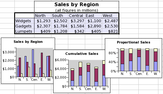
This screenshot shows a table of data and three column plots. The data consist of three series organized by row and starting with the words "Widgets", "Gadgets", and "Lumpets". Each of these series has values in five categories. The three graphs illustrate the three sub-types of column plots, with the series plotted independently in the left plot, stacked in the middle plot, and proportionately stacked in the right plot.
Each series in column plots can include three main elements and two error elements, although only the value element is necessary. The series can have a 'Name' element, which is a single text entry used to identify the series, must have a 'Values' element, which is a sequence of numeric values, and may have a 'Label' element, which is a sequence of text entries used to identify the categories. All of these elements can be defined as references to a region of the worksheet, as literally defined entries, or as formula expressions which result in the correct type. The 'Label' element is shared by all of the series. The legend added to a column plot identifies the different series, by default using the entries of the 'Name' element of each series. The two error elements include a list for errors in the positive direction and one for errors in the negative direction.
| Element | Type | Example |
|---|---|---|
| Name | A single textual element labeling the data series. These will be used in the legend which may be displayed with the column plot. | {"Widgets"} |
| Value | A series of numeric values. | {1293, 2502, 3297, ,1100, 2487} |
| Label | A series of textual elements labeling each value. Generally, this series will have as many entries as there were in the "Value" series. These entries are shared by all the series in the column plot. | {"North", "South", "Central", "East", "West"} |
| Error (+) | A list of numeric values with as many elements as there were in the 'Value' list. These values can be in the same units as the numeric values in the 'Value' list, can be proportions or can be proportions multiplied by one hundred. | {0.10, 0.12, 0.09, 0.11, 0.09} |
| Error (-) | A list of numeric values with as many elements as there were in the 'Value' list. These values can be in the same units as the numeric values in the 'Value' list, can be proportions or can be proportions multiplied by one hundred. | {0.08, 0.11, 0.10, 0.09, 0.11} |
Column plots provide three icons to choose between three plot sub-types.
-

-
The icon for pie plot of style with joint slices.
-

-
The icon for pie plot of style with joint slices.
-

-
The icon for pie plot of style with joint slices.
10.3.8. Line Plots
Line plots present the numeric values of categorical data with the data values of each series connected by a line. Sequential data values are considered to belong to different categories and are plotted along the horizontal (X) axis at equally spaced intervals. The data values from different series are assigned to these categories based on the position of the value in the series, for example, the second data value taken from each series all share one category. The data values are plotted along the vertical (Y) axis according to their numeric value and the particular sub-type chosen for the line plot.
Line plot sub-types provide three options for relating the values from different data series. The first sub-type plots each series independently with the data value determining the vertical distance between each point and the horizontal axis. The second sub-type plots the series stacked on each other in a cumulative fashion with the data value of each series determining the vertical distance from the point to the sum of the values in all the previous series. For example, if the first series starts with values {3.9, 4.2, ...}, the second series with values {1.2, 3.5, ...}, and the third series with values {3.1, 1.9, ...}, then the point value for the second element of the third series will be plotted at 9.6 (9.6=4.2+3.5+1.9) along the vertical axis. The third sub-type plots each series based on the proportional contribution of the value to the total of all values in that category. Using the example above, the three values would be plotted at 0.4375, 0.8020, and 1 because the intervals between zero and each of these numbers is 0.4375=4.2/(4.2+3.5+1.9) for the first, 0.3645...=3.5/(4.2+3.5+1.9) for the second, and 0.1979...=1.9/(4.2+3.5+1.9) for the third, although, by default, these numbers are presented as percentages on the vertical (Y) axis.
Two styles are available by default for line plots. In the first no markers are placed on the value of the point whereas in the second a point marker is added wherever the points are plotted.
This screenshot shows a table of data and three line plots. The data consist of three series organized by row and starting with the words "Widgets", "Gadgets", and "Lumpets". Each of these series has values in five categories. The three graphs illustrate the three sub-types of line plots, with the series plotted independently in the left plot, stacked in the middle plot, and proportionately stacked in the right plot.
Each series in line plots can include three main elements and two error elements, although only the value element is necessary. The series can have a 'Name' element, which is a single text entry used to identify the series, must have a 'Values' element, which is a sequence of numeric values, and may have a 'Label' element, which is a sequence of text entries used to identify the categories. All of these elements can be defined as references to a region of the worksheet, as literally defined entries, or as formula expressions which result in the correct type. The 'Label' element is shared by all of the series. The legend added to a line plot identifies the different series, by default using the entries of the 'Name' element of each series. The two error elements include a list for errors in the positive direction and one for errors in the negative direction.
| Element | Type | Example |
|---|---|---|
| Name | A single textual entry labeling the data series. These will be used in the legend which may be displayed with the line plot. | {"Widgets"} |
| Value | A list of numeric values. | {1293, 2502, 3297, 1100, 2487} |
| Label | A list of textual entries labeling each value. Generally, this series will have as many entries as there were in the 'Value' series. These entries are shared by all the series in the line plot. | {"North", "South", "Central", "East", "West"} |
| Error (+) | A list of numeric values with as many elements as there were in the 'Value' list. These values can be in the same units as the numeric values in the 'Value' list, can be proportions or can be proportions multiplied by one hundred. | {0.10, 0.12, 0.09, 0.11, 0.09} |
| Error (-) | A list of numeric values with as many elements as there were in the 'Value' list. These values can be in the same units as the numeric values in the 'Value' list, can be proportions or can be proportions multiplied by one hundred. | {0.08, 0.11, 0.10, 0.09, 0.11} |
Line plots provide six icons to choose between three plot sub-types each with two different styles.
-

-
The icon for a line plot of the sub-type with independent, overlapping lines and of the style without point markers.
-

-
The icon for a line plot of the sub-type with stacked lines and of the style without point markers.
-

-
The icon for a line plot of the sub-type with stacked proportion lines and of the style without point markers.
-

-
The icon for a line plot of the sub-type with overlapping lines and of the style with point markers.
-

-
The icon for a line plot of the sub-type with stacked lines and of the style with point markers.
-

-
The icon for a line plot of the sub-type with stacked proportion lines and of the style without point markers.
10.3.10. Pie Plots
Pie plots present the numeric values from a single series of categorical data as slices of a circular area, the angular arc of each slice determined by the proportional magnitude of each value compared to the overall sum of all the values. For example, if the series had values { 1.12, 4.48, 3.36, 1.68, 0.56}, the contribution of each slice to the total would be {0.10, 0.40, 0.330, 0.15, 0.0 5}, since 0.10= 1.12/(1.12+4.48+3.36+1.68+0.56), and the angular arcs of the wedges would be {36, 144, 108, 54, 18} degrees, since 36=0.10*360.
Pie plots do not have any sub-types.
Pie plot styles provide two choices for the rendering of the pie chart, either with all slices linked into one overall circle, or with gaps between the slices. The size of the gap is a property of the pie plot which can be changed.
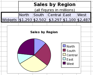
This screenshot shows a table of data and a pie plot. The data consist of a single data series organized in a row and starting with the word "Widgets". The series has values in five categories. The legend includes the names of the different data categories.
Each pie plot contains a single series which can include three elements although only the value element is necessary. The series can have a 'Name' element, which is a single text entry used to identify the series, must have a 'Values' element, which is a sequence of numeric values, and may have a 'Label' element, which is a sequence of text entries used to identify the categories. All of these elements can be defined as references to a region of the worksheet, as literally defined entries, or as formula expressions which result in the correct type. The legend added to a pie plot identifies the different categories using the entries in the 'Label' element.
| Element | Type | Example |
|---|---|---|
| Name | A single textual entry labeling the data series. | {"Widgets"} |
| Value | A list of numeric values. | {1293, 2502, 3297, 1100, 2487} |
| Label | A list of textual entries labeling the category of each value. Generally, this series will have as many entries as there were in the 'Value' list. These will be used in the legend which may be displayed with the pie plot. | {"North", "South", "Central", "East", "West"} |
Pie plots do not have any sub-types but provide two icons to distinguish the style of the plot allowing a choice between pie plots which comprise a single circular area or plots with distinct pie slices separated by small gaps.
-

-
The icon for a pie plot of the style with joint slices.
-

-
The icon for a pie plot of the style with separated slices.
10.3.12. Radar Plots
Radar plots present the numeric values of categorical data as a set of points plotted along a set of axes radiating from a central point, with as many axes as there are values in the series and with the points connected by a line, possibly with the interior of the shape filled in. Sequential data values are considered to belong to different categories and are plotted on separate axes which are not necessarily orthogonal and radiate from a central point. Sequential points are connected by a line with the final point connected back to the first to form a closed polygon. The data values from different series are assigned to categories based on the position of the value in the series, for example, the second data value taken from each series all share one category and will therefore all be plotted on the same axis. The data values are plotted along the axis of each class according to their numeric value.
Radar plots do not have any sub-types.
Radar plot styles provide three choices for the rendering of the chart. The first style presents the radar chart as only a polygon of lines. The second style also includes a marker where the data values are plotted on each axis. The third style plots the radar chart as a filled polygon.
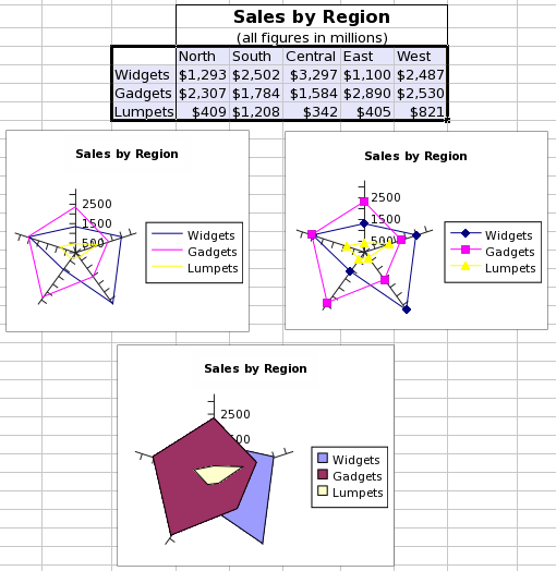
This screenshot shows a table of data and three radar plots. The data consist of three series organized by row and starting with the words "Widgets", "Gadgets", and "Lumpets". Each of these series has values in five categories. The three graphs illustrate the three sub-types of radar plots, with the top left plot including lines only, the top right plot including both lines and markers on the points, and the bottom middle plot using filled polygons.
Each series in radar plots can include three main elements and two error elements, although only the value element is necessary. The series can have a 'Name' element, which is a single text entry used to identify the series, must have a 'Values' element, which is a sequence of numeric values, and may have a 'Label' element, which is a sequence of text entries used to identify the categories. All of these elements can be defined as references to a region of the worksheet, as literally defined entries, or as formula expressions which result in the correct type. The 'Label' element is shared by all of the series. The legend added to a radar plot identifies the different series, by default using the entries of the 'Name' element of each series. The two error elements include a list for errors in the positive direction and one for errors in the negative direction.
| Element | Type | Example |
|---|---|---|
| Name | A single textual element labeling the data series. | {"Widgets"} |
| Value | A series of numeric values. | {1293, 2502, 3297, 1100, 2487} |
| Label | A series of textual elements labeling each value. Generally, this series will have as many entries as there were in the 'Value' series. | {"North", "South", "Central", "East", "West"} |
| Error (+) | A list of numeric values with as many elements as there were in the 'Value' list. These values can be in the same units as the numeric values in the 'Value' list, can be proportions or can be proportions multiplied by one hundred. | {0.10, 0.12, 0.09, 0.11, 0.09} |
| Error (-) | A list of numeric values with as many elements as there were in the 'Value' list. These values can be in the same units as the numeric values in the 'Value' list, can be proportions or can be proportions multiplied by one hundred. | {0.08, 0.11, 0.10, 0.09, 0.11} |
Radar plots provide three icons distinguishing the three different styles.
-

-
The icon for a radar plot with the style displaying simple lines only.
-

-
The icon for a radar plot with the style displaying both lines and point markers on the data values.
-

-
The icon for a radar plot with the style displaying a filled area.
10.3.13. Ring Plots
Ring plots present the numeric values of categorical data as segments of circular rings. Sequential data values are considered to belong to different categories and are plotted with distinct patterns. The data values from different series are assigned to these categories based on the position of the value in the series, for example, the second data value taken from each series all share one category. The data values are used to determine the size of the arc based on the proportionate size of the data value to the sum of all data values in the series. For example, if the series had values { 1.12, 4.48, 3.36, 1.68, 0.56}, the contribution of each ring section to the total would be {0.10, 0.40, 0.330, 0.15, 0.0 5}, since 0.10= 1.12/(1.12+4.48+3.36+1.68+0.56), and the angular arcs of the sections would be {36, 144, 108, 54, 18} degrees, since 36=0.10*360.
Ring plots do not have any sub-types.
Ring plot styles provide two choices. Ring plots can be plotted with all segments linked into a single overall ring, with different series plotted immediately adjacent to one another in sequentially larger rings. Alternatively, the segments of the outermost ring can be split and float a certain distance away from the next ring.
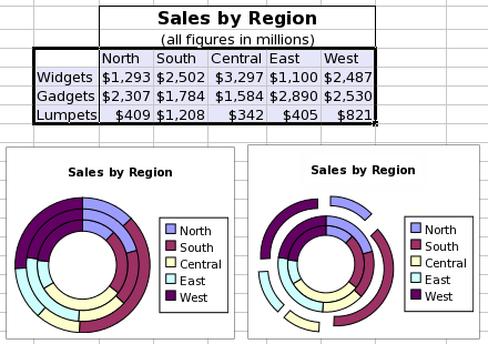
This screenshot shows a table of data and two ring plots. The data consist of a single data series organized in a row and starting with the word "Widgets". The data consist of three series organized by row and starting with the words "Widgets", "Gadgets", and "Lumpets". Each of these series has values in five categories. The two graphs illustrate the two sub-types of ring plots, the left most plot without any gaps and the right most plot having the outer plot with gaps.
Each series in ring plots can include three main elements and two error elements, although only the value element is necessary. The series can have a 'Name' element, which is a single text entry used to identify the series, must have a 'Values' element, which is a sequence of numeric values, and may have a 'Label' element, which is a sequence of text entries used to identify the categories. All of these elements can be defined as references to a region of the worksheet, as literally defined entries, or as formula expressions which result in the correct type. The 'Label' element is shared by all of the series. The legend added to a ring plot identifies the different series, by default using the entries of the 'Name' element of each series. The two error elements include a list for errors in the positive direction and one for errors in the negative direction.
| Element | Type | Example |
|---|---|---|
| Name | A single textual element labeling the data series. | {"Widgets"} |
| Value | A series of numeric values. | {1293, 2502, 3297, 1100, 2487} |
| Label | A series of textual elements labeling each value. Generally, this series will have as many entries as there were in the "Value" series. | {"North", "South", "Central", "East", "West"} |
| Error (+) | A list of numeric values with as many elements as there were in the 'Value' list. These values can be in the same units as the numeric values in the 'Value' list, can be proportions or can be proportions multiplied by one hundred. | {0.10, 0.12, 0.09, 0.11, 0.09} |
| Error (-) | A list of numeric values with as many elements as there were in the 'Value' list. These values can be in the same units as the numeric values in the 'Value' list, can be proportions or can be proportions multiplied by one hundred. | {0.08, 0.11, 0.10, 0.09, 0.11} |
Ring plots provide two icons distinguishing the two different styles.
-

-
The icon for a ring plot with the style of displaying series in contiguous rings.
-

-
The icon for a ring plot with the style of displaying the outermost series separated from the rest.
10.3.15. Surface Plots
Surface plots are used to plot (x,y ,z) points in three-dimensional space as a surface where z is interpreted as the height above the xy-plane. A Gnumeric chart of course shows the projection of this surface in 3-space onto a 2-dimensional sheet.
Surface plot sub-types provide for 2 distinct ways of providing the data for a surface plot.
The first subtype uses an n by 1 or 1 by n range for the x-values, a second 1 by m or m by 1 range for the y-values and an m by n range for the z values. The plotted points are constructed from these three ranges in such a way that the z value in the ith column and jth row is combined with the ith x value and the jth y value. This subtype then uses an m by n grid for the surface.
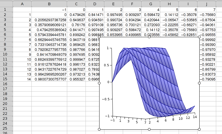
The second subtype uses a direct listing of the n points. The x values are specified with an n by 1 range, so are the y and z values. The ith z value is then combined with the ith x and ith y value to obtain the points to be plotted.It is not necessary to provide the same number of y coordinates for each x coordinate or vice versa. Gnumeric will interpolate missing values. For this purpose one needs to specify the number of (equidistant) rows and columns to be used for the surface grid. This grid need not align with the provided coordinates.
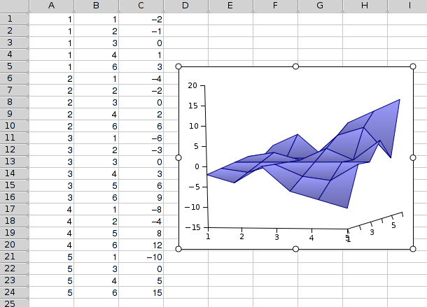
Surface plots do not have any pre-defined styles.
| Element | Type | Example |
|---|---|---|
| Name | A single textual element labeling the data series. These will be used in the legend which may be displayed with the surface plot. | {"Widgets"} |
| X | An optional series of numeric values to be used for the x coordinates of the grid. This defaults to {1,2,…,n}. | {1,3,5,6,8,9} |
| Y | An optional series of numeric values to be used for the y coordinates of the grid. This defaults to {1,2,…,n}. | {1,1.5,2,2.5} |
| Z | A rectangular range of numbers where the number in jth row and ith column is the height of the (i,j) grid point. | A2:J15 |
| Element | Type | Example |
|---|---|---|
| Name | A single textual element labeling the data series. These will be used in the legend which may be displayed with the surface plot. | {"Widgets"} |
| X | A series of numeric values to be used for the x coordinates of the grid. | {1,1.5,2,2.5} |
| Y | A series of numeric values to be used for the y coordinates of the grid. | {1,1.5,2,2.5} |
| Z | A series of numeric values to be used for the z coordinates of the grid. | {1,1.5,2,2.5} |
Surface plots provide two icons to choose one of the two surface plot sub-types.
-

-
The icon for an area plot of the sub-type with rectangular data area.
-

-
The icon for an area plot of the sub-type with xyz series.
10.3.16. XY Scatterplots
The data values of two series of equal length are plotted on the Cartesian (X-Y) plane, the value from the first series determining the position of the plotted symbol along the X axis, and the value from the second series determining the position of the plotted symbol along the Y axis. Data can be plotted as points only, with each pair of data series having different symbols, or, alternatively, sequential data pairs can be connected by a line, or, finally, both symbols and a connecting line can be used.
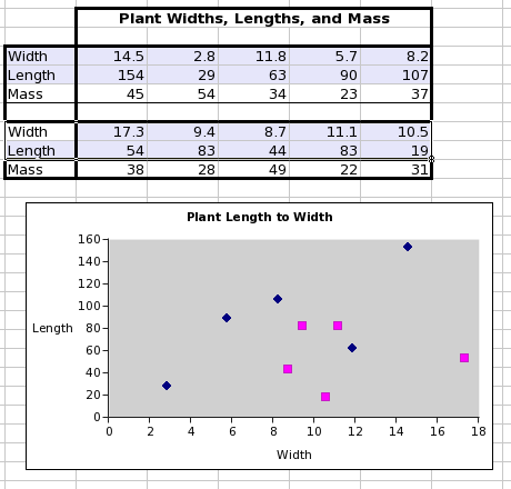
This screenshot shows a data table with two different series highlighted which are usable in a scatterplot. Each series is comprised of two lists of numeric values. The screenshot also shows the scatterplot made from these two data series.
Each series in a scatterplot can include three core components and four optional error components. The series may have a name, a single text value which will identify the series in the Graph Guru and in any legend attached to the chart. The series must have two lists of quantitative values, a list of X values and a list of Y values, which must have an equal number of elements. The series may also contain lists of error values for each of the X and Y lists with a positive and a negative component for each.
| Element | Type | Example |
|---|---|---|
| Name | A single textual element labeling the data series. | {"Series1"} |
| X | A list of numeric values, which will place the values along the horizontal axis. | {14.5, 2.8, 11.8, 5.7, 8.2} |
| Y | A second list of numeric values, which will place the values along the vertical axis. | {154, 29, 63, 90, 107} |
| X Error (+) | A list of numeric values with as many elements as there were in the 'X' list. These values can be in the same units as the numeric values in the 'X' list, can be proportions or can be proportions multiplied by one hundred. | {0.10, 0.12, 0.09, 0.11, 0.09} |
| X Error (-) | A list of numeric values with as many elements as there were in the 'X' list. These values can be in the same units as the numeric values in the 'Value' list, can be proportions or can be proportions multiplied by one hundred. | {0.08, 0.11, 0.10, 0.09, 0.11} |
| Y Error (+) | A list of numeric values with as many elements as there were in the 'Y' list, and therefore in the 'X' list. These values can be in the same units as the numeric values in the 'Y' list, can be proportions or can be proportions multiplied by one hundred. | {0.09, 0.11, 0.10, 0.12, 0.09} |
| Y Error (-) | A list of numeric values with as many elements as there were in the 'Y' list, and therefore in the 'X' list. These values can be in the same units as the numeric values in the 'Y' list, can be proportions or can be proportions multiplied by one hundred. | {0.10, 0.09, 0.08, 0.11, 0.11} |
XY scatterplots provide three icons to select between different style options. The plots can be rendered with markers at each point, with markers at each point and a line joining adjacent values in the data lists, or with a line but no markers.
-

-
The icon for scatterplot of style with only a marker at each point.
-

-
The icon for scatterplot of style with a marker at each point and a line between adjacent points in the value lists.
-

-
The icon for scatterplot of style with only a line between adjacent points in the value lists.