Graphing
A major function of moderns spreadsheets is to provide a quick and easy way to plot numerical data in graphical charts of various kinds. The use of graphs provides users a way to explore data to discover relationships and trends in the data values. Graphs also provide an effective way to present data so as to demonstrate relationships in the data and summarize large amounts of data in an effective image. In Gnumeric, both of these can be done easily and efficiently. Information on the creation of graphical displays of data is presented in greater detail in Chapter 9 ― Graphics: Images, Widgets, and Drawings.
When graphs are used to explore data, the aim is usually to produce a plot quickly with a minimum of effort. These plots are not designed to look polished but must present the required information as quickly as possible. To produce these graphs, users must learn a simple series of operations which will produce the desired plots. For speed, the most critical operation involves selecting the cells on the spreadsheet which will be used as data before starting the graphing process.
Graphs which are used to present data must be carefully crafted to communicate effectively. Clarity of communication is the critical factor and the plot may include a large amount of work to ensure that the visual result of the plot helps to communicate the desired result.
The use of a graph may not be the best way to communicate information. A verbal explanation or a simple table are often sufficient and, because they are more compact, may be more effective ways to communicate.
Graphs which use a large number of the graphical features available in Gnumeric often appear cluttered. The visual richness of such images can often obscure the message contained in the presentation of the data. Sparse, elegant and direct graphs will communicate results most effectively.
- 3.10.1. A Simple Graphing Example
3.10.1. A Simple Graphing Example
This section will introduce the process of creating a graph by presenting an example of a side-by-side column plot.
- 3.10.1.1. Data for the examples.
- 3.10.1.2. Making the Column Plot
- 3.10.1.3. Modifying the Simple Graph
3.10.1.1. Data for the examples.
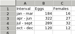
Because a graph requires data, it is first necessary to create some simple data to use in these examples. First we have to input these data into a worksheet. The data used are shown in Figure 3-3. For clarity in this discussion, the word "Interval" should be in cell A1.
3.10.1.2. Making the Column Plot
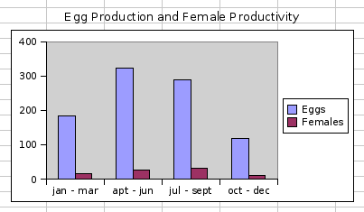
A column plot presents a series of data points as columns whose height depends on the value of each datum. This is a useful type of plot to show the number of eggs produced in each interval.
-
The quickest way to make a plot starts with the selection of the data. Using the mouse, first select the range A1:C5 which includes the data both for the number of Eggs and for the number of Females.
-
Next, click on the graphing toolbar button
 which looks like three colored pillars. This launches a
new window called the graph guru.
which looks like three colored pillars. This launches a
new window called the graph guru.
-
Next, click on the word "Column" next to the icon with vertical colored bars
 which will move the selection to that row.
-
Click on the "Insert" button. This will make the druid disappear and leave the mouse cursor as a thin cross hair.
-
Finally, we will place and size the graph on a sheet. Click on the sheet and drag downward and to the right. As the mouse is dragged, a rectangle will expand. When the mouse button is released, a simple column chart should appear.
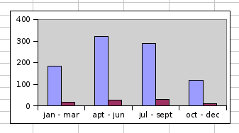
The simple graph should look like Figure 3-4.
3.10.1.3. Modifying the Simple Graph
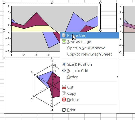
The graph can be customized with titles, extra charts, overlaid plots, label boxes and lots of extra information. To customize the graph, right click on the plot to open the graph custom menu. The graph context menu will appear as shown in Figure 3-5.
This menu provides access to several functions. Users can customize the appearance of graphs by selecting the menu item, can save the graph into PNG or SVG formats using the menu item, can reorder the various graphical elements displayed in the worksheet using the , , , and menu items or can delete graphical elements with the menu item.
If we wanted to add a title and a legend to the graph, we could use the menu item to open the graph editor and customize the graph as follows:
-
Right click on the graph to open the context menu and select the menu item. This will open the graph editor.
-
The graph editor opens with the top-level "Graph" entry selected in the element tree displayed in the top left pane of the editor. The top right pane of the editor displays a preview of the eventual graph. The bottom pane of the editor has a single or several tabs presenting the elements which can be modified for the particular item selected in the element tree. Click and hold on the button
 to open the menu of elements addable to a graph. Note that
this menu changes depending on the element selected in the
element tree when the is
clicked. Drag the mouse cursor down until the selection
highlights the "Title" entry and release the mouse
button. This will add a "Title" node in the graph element
tree and change the selection to this "Title" node. The
bottom pane of the graph editor will also change to
display the modifiable characteristics of the "Title"
element.
to open the menu of elements addable to a graph. Note that
this menu changes depending on the element selected in the
element tree when the is
clicked. Drag the mouse cursor down until the selection
highlights the "Title" entry and release the mouse
button. This will add a "Title" node in the graph element
tree and change the selection to this "Title" node. The
bottom pane of the graph editor will also change to
display the modifiable characteristics of the "Title"
element.
-
In the text field of the tab displayed in the bottom pane of the graph editor, add a title such as "Egg Production and Female Productivity" and type the Enter key. Note that the title appears at the top of the graph in the preview pane.
-
In the graph tree, select the node labelled "Chart1". Next, click and hold on the add button, drag down to the menu item and release. Note that this adds a legend on the right of the graph in the preview pane.
-
Click on the "Apply" button. The plot should now have a title and a legend. Note that Gnumeric has used the words in the column headers automatically to label the two data series in the legend.
The modified graph should look like Figure 3-6.