GUI Widgets
A Gnumeric worksheet can graphical user interface (GUI) elements, commonly called 'widgets', which can be tied to the data contents of worksheet cells. For example, users can add a slider widget which, when the position of the slider moves, alters the numeric value in a worksheet cell.
The current implementation of these widgets is incomplete. Some of the obvious configuration settings for these widgets do not exist and much of the functionality that these widgets should exhibit has not been implemented. Future versions of Gnumeric will complete these widgets and make them functional.
Widgets currently stay above all the other graphical elements because they use a different system to calculate their positions than the other graphical elements do. This will also be fixed in future updates.
Each of these elements can be added by selecting the appropriate icon on the object toolbar and using the thin cross-hair mouse pointer to place the element on the worksheet by clicking or by click-dragging with the primary mouse button. This process is explained in greater detail in Section 9.1.1 ― Adding Graphical Elements.
Each of these elements can be configured using the context menu and its menu item, as explained in Section 9.1.5 ― Modifying Graphical Elements.
Each of these elements can be moved and resized on the worksheet, as explained in Section 9.1.3 ― Moving and Resizing Graphical Elements.
The stacking order, from the front to the back, which determines which widgets obscure each other, can be changed using the entries in the context menu, as explained in Section 9.1.7 ― Restacking Graphical Elements. However, as explained in the note above, the widgets do not currently stack under the other graphical elements.
Each of these elements can be deleted using the context menu and its menu item, as explained in Section 9.1.8 ― Deleting Graphical Elements.
- 9.3.1. Labels.
- 9.3.2. Frames.
- 9.3.3. Checkboxes.
- 9.3.4. Scrollbars.
- 9.3.5. Spinbuttons.
- 9.3.6. Sliders.
- 9.3.7. Lists.
- 9.3.8. Combination Boxes.
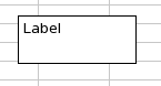
9.3.1. Labels.
Labels are intended to be small text elements which can be added to the worksheet. Since it is currently not possible to edit the text field, these widgets are not currently usable. The properties of the border and background of the widget can be changed but, because the word "Label" is always present, the rectangle drawing element, presented in Section 9.4.3 ― Drawing Rectangles. will be more useful.
9.3.1.1. Configuring the properties of the label
The properties of the label can be altered with the menu item in the context menu which appears when the mouse cursor is placed over the label and one of the secondary mouse buttons is pressed.
The label outline color and width, as well as the background, "fill", color can be changed.
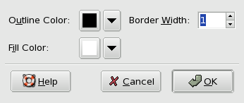
The color of the label outline can be altered by moving the mouse pointer over the button with the icon of a small, black, downward pointing arrow and then clicking with the primary mouse button. This will open up a panel with a number of standard colors presented as small squares. Any of these colors can be selected by moving the mouse pointer over the desired color and pressing once with the primary mouse button. Alternatively, a custom color can be chosen by clicking on the button at the bottom of the panel. This will open up the color chooser dialog. In this dialog colors can be defined using the numeric boxes or can be selected using the color triangle. The color can be selected by Clicking on the outer circle while the darkness or lightness can be selected by clicking inside the triangle. Once the desired color has been configured, this color can be used for the label outline by clicking on the button.
The border width can be changed either by typing a new number into the text box or by using the up and down arrows to increment or decrement the width number.
The color of the background fill can be changed in the same way as the color of the outline border, which was explained above.
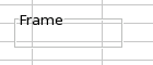
9.3.2. Frames.
Frames are intended to be transparent boxes with a title that can be placed around part of the worksheet to highlight that area. Because the format of the border of these widgets cannot be altered, they are less visible than they could be. A similar frame, without the title, can be made with the rectangle drawing element, which is presented in Section 9.4.3 ― Drawing Rectangles..
9.3.2.1. Configuring the properties of the checkbox
The properties of the frame can be altered with the menu item in the context menu which appears when the mouse cursor is placed over the frame and one of the secondary mouse buttons is pressed.
Currently, only the word that appears in the frame can be altered.
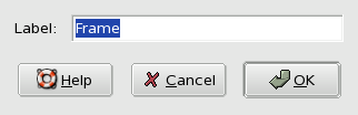
The word displayed in the frame can be altered by typing new text in the textbox next to the word "Label".
9.3.3. Checkboxes.
Checkboxes are widgets which allow a user to visually see the state of an entity, whether it is checked or not, and tie this state to the truth value of a Boolean cell, "TRUE" if the checkbox is checked and "FALSE" the checkbox is not. The check box can be used to alter the value of a cell, which will alter any other cells whose values are computed based on the dependent cell. This provides a simple way to alter a whole series of computations.
9.3.3.1. Configuring the properties of the checkbox
The properties of the checkbox can be altered with the menu item in the context menu which appears when the mouse cursor is placed over the checkbox and one of the secondary mouse buttons is pressed.
Checkboxes have two properties which can be configured: the worksheet cell whose value will be altered by clicking in the checkbox and the text displayed on the checkbox.
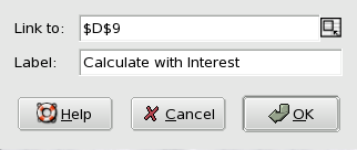
The "Link to:" field allows the user to select a cell that will be changed in response to changes in the state of the widget. A user can type the name of a cell in the text box or may click in the text box to activate it and then click on the worksheet to select the desired cell and Gnumeric will automatically add a reference to the cell.
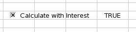
The "Label" field accepts a text value which will appear next to the checkbox. This text can indicate what the checkbox field alters, for instance in Figure 9-10 the checkbox could be used to alter a series of calculations, between including interest or excluding it, from the computation.
9.3.4. Scrollbars.
Scrollbars are widgets that allow the changing of a numeric value by click-dragging with the mouse.
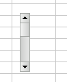
The scrollbar widget can be used in three ways: by dragging the 'thumb', by clicking on the arrows, or by clicking in the 'channel'. The 'thumb' is the small rectangular element between the two arrow buttons. The 'thumb' can be dragged by placing the mouse pointer over the thumb, clicking and holding with the primary mouse button and then dragging the mouse pointer up or down. Clicking on the arrow buttons will scroll the thumb in the direction of the arrow. The 'channel' is the area between the arrows that is not the 'thumb'. A mouse click with the primary mouse button when the mouse pointer is over the 'channel' will cause the scrollbar to move a 'page'. The motion of the 'thumb' will cause a numeric value to change based on the configuration of the widget, as is explained below.
9.3.4.1. Configuring the properties of the scrollbar
The properties of the scrollbar can be altered with the menu item in the context menu which appears when the mouse cursor is placed over the scrollbar and one of the secondary mouse buttons is pressed.
Scrollbars have five properties which can be configured: the worksheet cell whose value will be altered by movement of the scrollbar 'thumb', the minimum value when the thumb is at the top of its channel, the maximum value reached when the thumb is at the bottom of its channel, the smallest increment of change which is the change caused by clicking on the arrows, and the page increment which is the change which occurs when the channel is clicked.
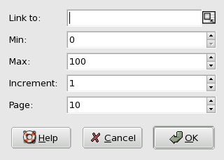
The "Link to:" field allows the user to select a cell that will be changed in response to changes in the state of the widget. A user can type the name of a cell in the text box or may click in the text box to activate it and then click on the worksheet to select the desired cell and Gnumeric will automatically add a reference to the cell.
The other properties can be changed either by typing a new number into the text box or by using the up and down arrows to increment or decrement the width number.
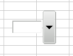
9.3.5. Spinbuttons.
Spinbuttons, like sliders, are widgets that allow a user to change the numeric value in the cell by interacting with a widget. The value of spinbuttons can be changed either by typing a new number into the text box or by clicking on the arrow buttons. If the buttons are clicked and held, the numeric value will spin, incrementing or decrementing depending on the arrow being held.

9.3.5.1. Configuring the properties of the spinbutton
The properties of the spinbutton can be altered with the menu item in the context menu which appears when the mouse cursor is placed over the spinbutton and one of the secondary mouse buttons is pressed.
Spinbuttons have five properties which can be configured: the worksheet cell whose value will be altered by the spinbutton, the minimum value when the thumb is at the top of its channel, the maximum value reached when the thumb is at the bottom of its channel, the smallest increment of change which is the change caused by clicking on the arrows, and the page increment which is the change which occurs when the channel is clicked.
The "Link to:" field allows the user to select a cell that will be changed in response to changes in the state of the widget. A user can type the name of a cell in the text box or may click in the text box to activate it and then click on the worksheet to select the desired cell and Gnumeric will automatically add a reference to the cell.
The other properties can be changed either by typing a new number into the text box or by using the up and down arrows to increment or decrement the width number.
9.3.6. Sliders.
Sliders, like scrollbars and spinbuttons, allow a cell value to be changed based on user interaction with a widget on the screen.

The slider widget can be used in two ways: by dragging the 'thumb' or by clicking in the 'channel'. The 'thumb' is the small rectangular element between the two arrow buttons. The 'thumb' can be dragged by placing the mouse pointer over the thumb, clicking and holding with the primary mouse button and then dragging the mouse pointer up or down. The 'channel' is the area between the arrows that is not the 'thumb'. A mouse click with the primary mouse button when the mouse pointer is over the 'channel' will cause the scrollbar to move a 'page'. The motion of the 'thumb' will cause a numeric value to change based on the configuration of the widget, as is explained below.
9.3.6.1. Configuring the properties of the slider
The properties of the slider can be altered with the menu item in the context menu which appears when the mouse cursor is placed over the slider and one of the secondary mouse buttons is pressed.
Sliders have five properties which can be configured: the worksheet cell whose value will be altered by movement of the scrollbar 'thumb', the minimum value when the thumb is at the top of its channel, the maximum value reached when the thumb is at the bottom of its channel, the smallest increment of change, and the page increment which is the change which occurs when the channel is clicked.
The "Link to:" field allows the user to select a cell that will be changed in response to changes in the state of the widget. A user can type the name of a cell in the text box or may click in the text box to activate it and then click on the worksheet to select the desired cell and Gnumeric will automatically add a reference to the cell.
The other properties can be changed either by typing a new number into the text box or by using the up and down arrows to increment or decrement the width number.