The Interface Viewer Plugin shows the information and controls provided by the AT-SPI interfaces present in each accessible item from the Application Tree View. After selecting an item, you can use this plugin to quickly review its supported interfaces, to retrieve each interface's information, and to manipulate the item through all the interface’s methods.
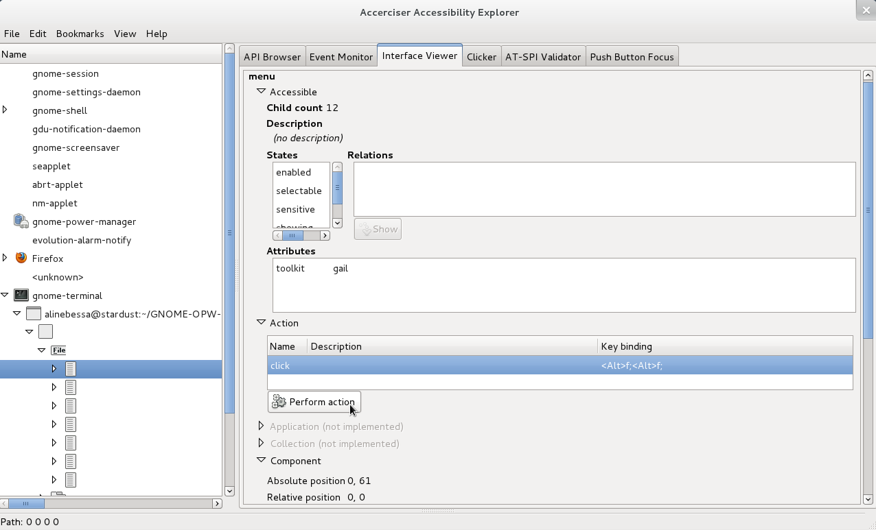
The first step to run the Interface Viewer Plugin is to select an item in the Application Tree View. After that, all AT-SPI interfaces covered by the plugin will be listed in the plugin's panel. The interfaces implemented by the selected item will be sensitive, so you can click each one of them to either retrieve their provided information or to interact with available methods. The following interfaces can be explored in Accerciser, assuming the selected item implements them:
Accessible - This interface shows the selected item's child count (number of child widgets), description, states, relations, and attributes.
Action - This interface shows all the actions that can be performed by the selected item. For each interface, you will see its name, such as "press" or "click", followed by a description and a key binding, if there are any. If you select an action, a "Perform action" button will become sensitive. Press this button to see the item performing the selected action.
Application - This interface can be implemented by items with role "application". It is worth to point out that items with role "application" not necessarily implement this interface. If the selected item implements it, the interface will show its ID and, if there are any, its toolkit and version.
Component - This interface shows the selected item's absolute position (with respect to the desktop coordinate system), relative position (with respect to the window coordinate system), size, layer type, MDI-Z-order (a short integer indicating the stacking order of the component in the MDI layer), and alpha (if alpha blending is used).
Document - This interface shows the selected item's document attributes and locale description, if there is one.
Hypertext - This interface shows a list with all the selected item's hypertext hyperlinks. For each hyperlink, the interface provides its name, URI, start (the index in the hypertext at which the hyperlink begins) and end (the index in the hypertext at which this hyperlink ends).
Image - This interface shows the selected item's description (or "no description" if unspecified), size, position (with respect to the desktop coordinate system), and locale, if there is one.
Selection - This interface shows all selectable child items of the selected item. If the selected item is a menu bar with options "File", "Edit", "View", and "Help", and all of them are selectable, then they will be listed in this interface. If you click a listed option - "File", for example - and want to clear it, just press the "Clear" button below the list.
Streamable Content - This interface shows the selected item's content types and their corresponding URIs.
Table - This interface shows the selected item's caption and summary, rows (number of rows), columns (number of columns), selected rows (number of selected rows), and selected columns (number of selected columns). For a selected cell, the interface shows its row's and column's header and extents.
Text - This interface shows the selected item's text content, that can be editable, and its attributes. The basic attributes are offset (the number of characters the text has) and justification. To see possible CSS attributes, click the "Include defaults" check box.
Value - This interface shows the selected item's current value, minimum allowed value, maximum allowed value, and the minimum increment by which the value may be changed (or zero if this value cannot be determined). The current value can be manually changed via a spin button.
Got a comment? Spotted an error? Found the instructions unclear? Send feedback about this page.